Scatter Plot
|
Menu: |
Analysis /
Cluster / Scatter
Plot (2D / 3D) |
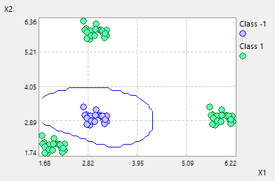
User is asked for selection
of the X-, Y- and Z-axis from the existing elements of the experiment. The
scatter plot of selected elements will be shown in 2D or in 3D. Each point
represents a data-set of the DOE-data. The color of the point is red if the
point violates the defined constraints. The point will be selected by
double-clicking on a row of the DOE table. If one
of the criteria is selected as the Z-Axis for this Scatter-Plot and this
criterion is defined as classification or clustering, the contour plots and the
color legends for this will be displayed.
Left mouse clicking on the scatter
plot, its options can be edited in the property windows.
- Compare: "Multi-Experiemnt" show data of different experiments, "Samples Table" show data of DOE and samples table on the same plot. Default setting is "Single-Experiment"
- Type: Classification or Cluster
- Show Label: If True, the label for classification will be shown.
- Z-Axis: User can select one of the
criteria as the Z-Axis for the contour plots if this criterion as defined
as classification
- Gridpoints: the number of grid points for
calculating the contour plots.
- Radius: The radius for the displaying
scatter points
- Color: The color for the individual
class points or for the total scatter-plot points
- Support Points: User can select test, training
or both points to display.
- Auto-Scale: If Auto-Scale is set
to True, the min. and max. values of the
axis will be calculated automatically. If it is set to False, user
can manually define the boundaries for the scatter plot.